Color Balance

Objective: Demonstrate knowledge of compositional and color balance by working with an asymmetrical compositional model.

We know that line, shape form, texture and space all influence the overall composition of a piece. Color, of course, also plays a large roll in compositional balance. By using color contrasts we already know such as Light/Dark, Complementary Contrasts, Cool/Warm, Saturated/Desaturated for example you can create a visually balanced composition.

Create a design using non-representational elements that showcases the use of color in compositional balance. Through careful choices in color and manipulation of those colors you should be able to create a composition that is asymmetrically oriented but overall balanced.

Mediums: The piece should be 5″x7″ minimum and made using acrylagouache or paper cutouts on bristol board.

IMG_6306Color _Balance_2

Posted in Uncategorized | Leave a comment

Final Assignment 2: Cooking up Colors

Part One: Your group is to cook a meal that includes an appetizer, main course (with two sides), and a desert. The food in this meal should reflect the color scheme that you are assigned. Be creative, dyeing all your food a color is not an option. Use the natural colors of the food and color created in the cooking process, to express your given palate. Provide at least enough food for five people to taste.

Part Two: Design a menu and recipe cards that reflects your assigned color scheme. The design concept is up to you. You need only provide one menu but provide enough recipe cards for everyone in the class. These should be professionally presented.

Plates, presentation, and overall setting should all be considerations. Let your inner Martha Stewart out.

Your meal will be presented at the final class. You should, as a group, be able to discuss your color palette, why you chose your colors and how they were applied. Groups will switch meals for tasting.

You will be graded on presentation, menu/card design (usual 2D requirements apply), adherence to your scheme, creativity and flavor.


Cooking_With_Color_Complimantary_Contrast_1_Color_Theory_guacheComp_Comp_Menu Cooking_With_Color_Monochromatic_Brown_2_Color_Theory_guache   Comp_4  Mono_Green_Detail_1 Triadic_1Cooking_With_Color_Secondary_Triadic_1_Color_Theory_guache

Posted in Uncategorized | Leave a comment

Final Assignment 1: Color Inventory, You Are What You Eat

Begin by thinking of your favorite food. Your goal is to summarize and catalog the colors found in that item of food, and use the inventory to create a design.

Begin your inventory with a 6”x6” square of flat color. The color should be taken directly from the object. You will then place a series of large “dots” on this square ground, each dot representing a color found in the object. The number of dots may vary, but the fewer the dots the more difficult it will be to characterize the overall coloration of the source. In most natural objects there are hundreds if not thousands of “colors” with multiple variations in hue, value and saturation. It will be impossible for you to catalog all of them. Somewhere between 10 and 20 should be sufficient. No two dots should be the same. Try to match the colors you observe precisely.

You will then create a 10”x12” Self Portrait using the colors found in your inventory. The design may be influenced by your object or may be in counterpoint to the qualities of the original form. While the inventory should be completed in gouache the self portrait may be done in any media.

To complete the project, present three pieces (your food or a photograph of your food, the inventory and the self portrait) together in a professional  manner appropriate to the media. Two dimensional pieces should be presented cover slipped and mounted on illustration board.Color_Inventory_digital copy IMG_5384

Posted in Uncategorized | Leave a comment

Portfolio Requirements

As promised here are the requirements for your final portfolio

Part One: One folder with a 100dpi at 5×7″ 1mb file size jpeg image of EVERYTHING you did in class, homework, in class work and your finals. These should be professional looking with a neutral background or cropped in close.

Part Two: A PDF with individual pages including the images above and a description, assignment, size and medium. I suggest creating a Powerpoint or other presentation program and saving it as a PDF. This should also be professional looking  (think of it as the document you would send to a gallery). The maximum size of this file should be 5mb.

All of this should be turned in on a CD or flashdrive (I may not be able to get them back to you, certainly not before the holiday).

All of this is due on the last day of class, December 1, 2016.

img_2788

Posted in Uncategorized | Leave a comment

Color Constancy

Paint a series of four (4) landscape studies of the view from your dorm room or apartment window. Each study should be 5” x 7”.

By paying particular attention to the landscape under different lighting situations, different times of day, and changing weather conditions we can learn to express the qualities of those conditions and show that color is a condition of light. The differences in lighting will result in distinct color schemes of your scene.

To make the initial painting come more easily, use adhesive tape to mask out a viewfinder on a windowpane in proportion to your 5” x 7” format. The viewfinder will frame the scene and reveal shapes in the visual field not only in relationship to each other but also in relationship to the boundary of the rectangle.

I suggest painting the large, major shapes first, covering the entire picture plane before adding any subsidiary tones.

These paintings can be loosely rendered or stylized if you prefer – remember this is more about capturing the colors than your painting skill. Try to render the colors as precisely as you see them. If colors are mixed and applied with care, the resulting picture can evoke the time of day or prevailing weather conditions.

color_constancy 1 Color_constancy_1 color_constancy 3

Posted in Assignments | Tagged , , , | Leave a comment

Psychological Self Portrait

Reading: Chapter Four, Psychological Effects of Color.

Part 1: Select a pair of verbal concepts that are either opposite or are in meaningful contrast with each other. For example: sullen/elated, emotional/rational, old/young. Using a passive format (e.g. a grid of dots on a background, a grid of squares, or any grid-based configuration) make two studies that are different only in their color. Try to make color analogues for each of your concepts, so that each verbal concept is represented in one of your two color schemes.

Part 2: Take the colors used in your passive color analogue studies and apply them to 2 identical self-portraits.

Each design should be 5”x7”. Mount all 4 designs together using professional presentation and craftsmanship skills.

20140225-080152.jpgPsychological_Self_Portrait_2_Color_Theory_guache copyPsychological_Self_Portrait_3_Color_Theory_guache copyPsychological_Self_Portrait_1_Color_Theory_guache copy

Posted in Uncategorized | Leave a comment

Color Schemes: Ten Letter Word

You will choose a 10 letter word expressing aspects and contexts of that word in FIVE different color schemes.

Begin by selecting a word from the dictionary – your word must contain a minimum of 10 letters. After you select your word, do some research! What are the various definitions of your word? Find all of the text, imagery and resource material you can. More is more. Find things that are not directly related to the word but share some connection to the word. Explore many different sources (use actual books). Be resourceful, think about solutions beyond your first inclinations. Take some chances with your choices, and use your imagination! I want you to incorporate different images/words to draw different and subtle meanings to your image/word.

From your collected source material, develop a design which expresses something about your word. You may incorporate the actual word if you like, but it is not required.

During class you will develop your designs using multiple color schemes (listed below). Initial sketches and color scheme explorations may be done in any media (colored pencil, marker, crayon, digital) but the final product should be executed using acryla-gouache on Bristol board. The final pieces should be mounted on black illustration board in dimensions that best work with your pieces.

Sketch size: 4×6

Painted design minimum size: 5×7 each.

Color Schemes:

• monochromatic

• analagous

• complementary

• split or double complementary

• triadic or quadratic harmony

Reading:

Color: Chapter 9: Color Combinations and Interactions

Color Basics: p.70-77

photo2

photo

Posted in Assignments | Tagged , , | Leave a comment

Color Explorations

Make a series of 8 designs exploring the characteristics of color: Hue, Value, Saturation and Temperature. Your designs can be simplified representational images or they may be non-objective or abstract but they must be thematically or stylistically linked in some way. Each design must have a minimum of 6 shapes or areas of different ‘color’. Each design should be 4”x6”, painted in acrylagouche on bristol board. The white of the paper should not be seen in any of the paintings. Mount all 8 designs together on a single sheet of black illustration board (no foam core please!).

A. CHROMATIC GRAYS-WIDE VALUE RANGE: In this you palette should be limited to chromatic greys but with a wide value range.

B. CHROMATIC GRAYS-NARROW VALUE RANGE: This piece is also limited to chromatic grays but further limited to a narrow value range. Choose a range with all the values congregating around the dark, middle or light part of the value continuum (maintain a broad hue range.)

C. DESATURATED HUES-WIDE VALUE RANGE: This piece is limited to desaturated hues. These hues should be more intense than the chromatic grays but less intense than a fully saturated hue.You should use a wide range of values in this piece.

D. DESATURATED HUES-NARROW VALUE RANGE: This piece is limited to desaturated hues with a broad hue range but a narrow value range.

E. FULLY SATURATED-WIDE VALUE RANGE: Saturated hues are purer and more intense in hue than desaturated hues. You should use a wide value range in this piece.

F. FULLY SATURATED-NARROW VALUE RANGE: hopefully you see the pattern here.

G. SATURATED-DESATURATED-CHROMATIC GREYS-WIDE VALUE RANGE: This is the everything piece use all the hue variations.

H. SATURATED-DESATURATED-CHROMATIC GREYS-NARROW VALUE RANGE: ALL the hue variations except limit your value range.


color_ex_3

Color_ex_1

color_ex_2

Posted in Assignments | Leave a comment

Hue: Temperature

Temperature refers to the relative warmth or coolness of a hue. Temperature is often overlooked but can be used as a powerful tool in the creation of depth and emotion in a piece. Temperature has also been connected to saturation as desaturated colors are generally seen to be cooler than their purer, more saturated relatives.

Warm colors are generally seen as arousing, active or cheerful. Cool color, on the other hand can be seen as calming, passive and subdued. Warm colors also tend to come forward or feel lighter than their cooler companions which can recede.

Part 1: Using a secondary color create a range, using nine 1.5″x1.5″ squares that show the relative warmth and coolness.

Part 2: Choose a single color that has a clear temperature, blue for cool or red for warm for example. Create a range of nine 1.5″x1.5″ squares that show a change in temperature of that single color from warm to cool while retaining the overall nature of the color i.e. blue should look blue across the scale.

Posted in Assignments | Leave a comment

Hue: Saturation

All of our color aspects are interrelated. Saturation is no different and we have, in fact, already dealt with saturation in our two previous assignments. Saturation is a hue’s intensity. A pure color is highly saturated, think of that pure, straight out of the tube purple. A desaturated hue is one that has lost it’s intensity, has become muted or dulled. Think now of those dull purples we mixed in the color wheel assignment.

A hue can be desaturated in many ways, mixing two or more colors together (that color wheel purple). Mixing a hue plus black or white also desaturates. Think about those duller value mixes we made in the value assignment.

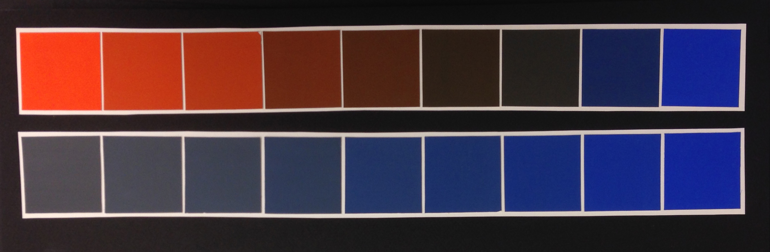
Mixing different hues does desaturate, but the two colors that desaturate each other the best and fastest but with the most control are a hue plus it’s compliment.

That is Part One of todays work. Take a hue and it’s compliment and mix nine 1.5×1.5″ squares so that you have a desaturation of the hues with a good grey in the middle. When two colors mix to create a grey we refer to that as a chromatic grey.

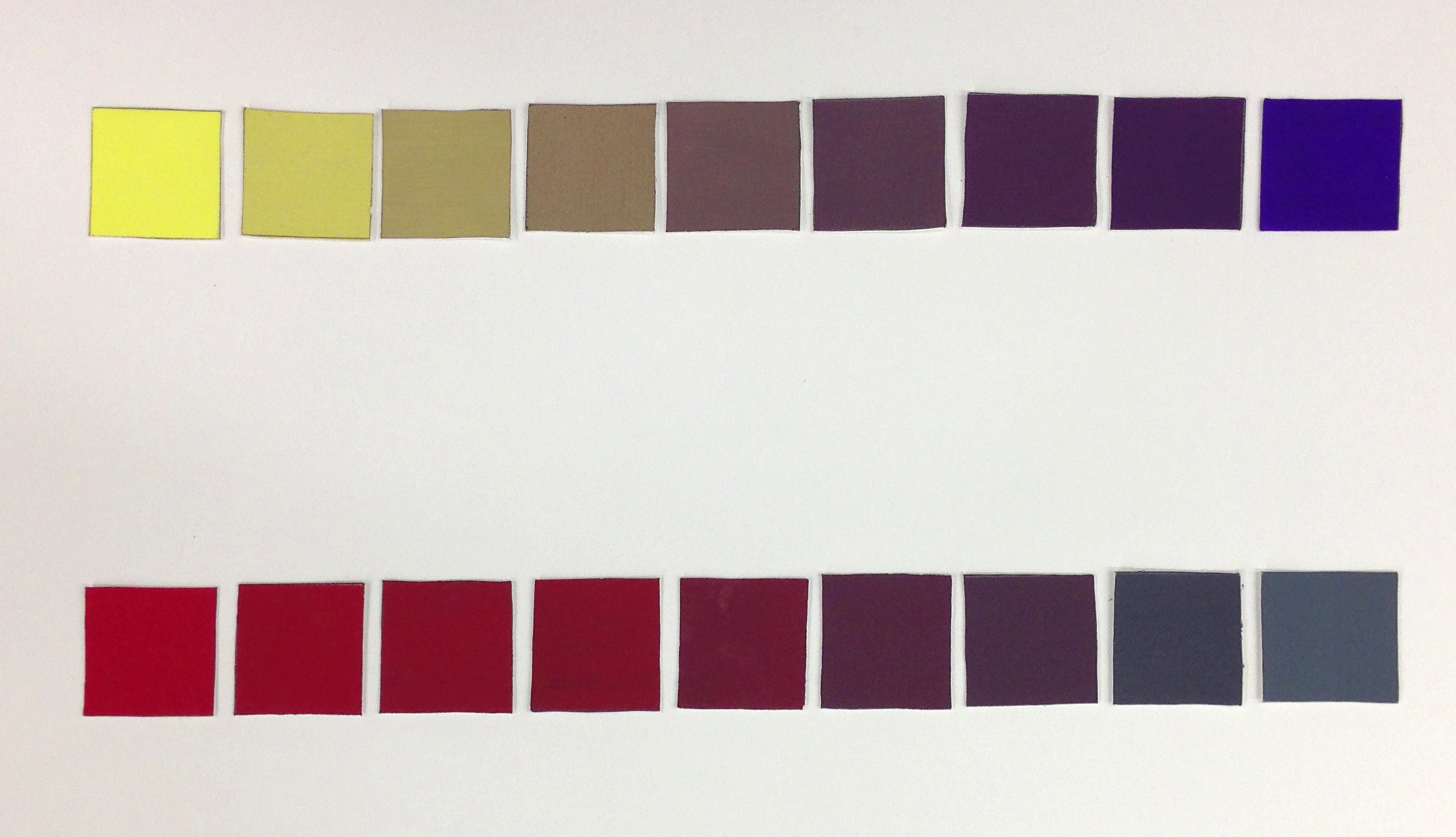
While our color aspects are linked they can be separated and controlled to create different effects. All the mixes we have done so far have resulted in a value change as well as a desaturation. In Part Two we will separate value from from desaturation.

In this assignment you should pick a hue and then mix up a batch of a black and white grey, an achromatic grey of equal value to your chosen hue. Mix nine 1.5×1.5″ squares so that you move from your hue to the matching achromatic grey. in these the saturation should change from saturated color to grey but because there is no value change between the two there should be no value change across the saturation  gradation. This is one you can test by taking a black and white photo. Those chips should all be the same grey in that photo.

When we mix a hue with it’s compliment or a mixed grey the resulting hue is called a shade.

Saturation_1 IMG_2398


Posted in Assignments | Leave a comment